SPONSORED
Denomination designs wine packaging specifically to a client’s brief and objectives. While some agencies have a house style they apply to brands they work on, Denomination’s ‘style’ is completely dictated by the brand and brief.
When Denomination redesigned the labels for the 2014 Penfolds Bin range, the brief was to evolve the packaging but to inject more premium cues and storytelling while retaining the traditional classic nature of the original label.
“We added small details such as the year that particular Bin made was first made, among many small changes,” managing director Rowena Curlewis says. “We also injected the desired cues including premiumness, craft and storytelling.”
Rowena says all types of design have their place. “Minimalist labels can work beautifully in the right environment for the right brand,” she says. “Heemskerk was designed more than eight years ago but still looks as contemporary today as when it was first launched. Our client wanted the brand to be positioned at the razor’s edge: ultra-modern, luxurious and pure.”
The creative solution for Heemskerk was to screenprint the bottles with a contemporary logotype and to recommend the use of sleek imported glass. The vintage, varietal and region were communicated through a small lozenge-shaped neck label. “That was radical at the time,” says Rowena. “The net effect was a standout contemporary, minimalistic package that stood well clear of the competitive set and offered consumers a contemporary alternative from Tasmania.”
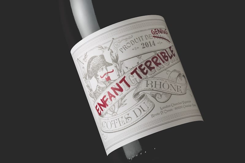
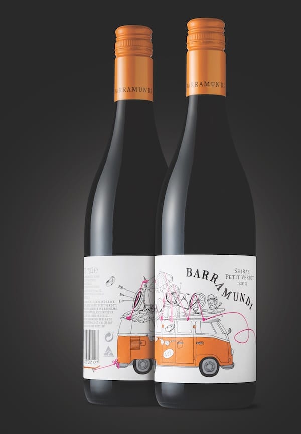
Rowena says busy labels also have their place: again, depending on the brand story and positioning. Barramundi is busy, eclectic and fun – like its brand personality. Enfant Terrible is a twist on a classic Rhone label: the design features Napoleon as part of a traditional French label which has been altered at the winery by the enfant terrible whose graffiti has added a level of cheekiness and edginess.
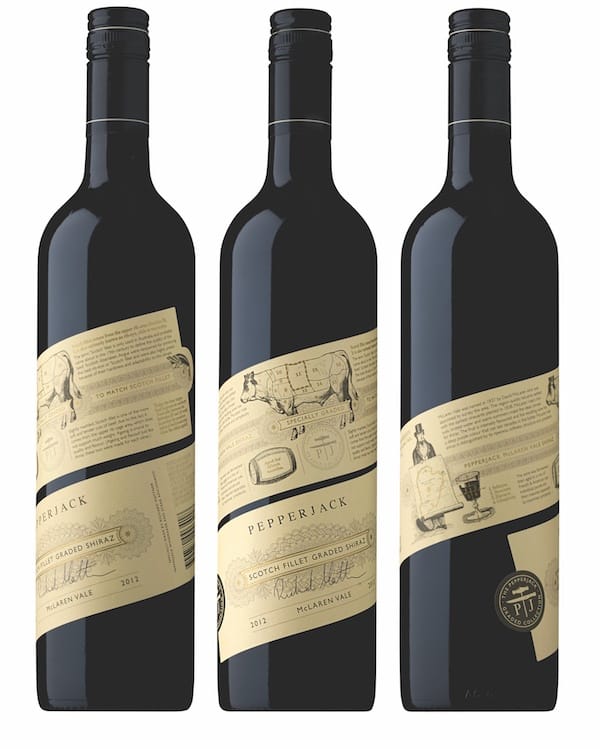
The Pepperjack Graded Collection label is jam-packed full of copy and graphics and wraps around the bottle. “The unique format of this incredibly long 40cm label encourages consumers to keep twisting the bottle to read and learn,” Rowena says. “The shelf standout comes through the unique angled label and the wraparound format that is highly differentiated on shelf.”
Rowena says Denomination is well aware it holds a client’s future in its hands.
“The wine industry is filled with down-to-earth characters and some very smart ones, too, and we are lucky to be able to work with a lot of like-minded clients who value the creativity and experience we can bring to their businesses,” she says. “If we feel a client just wants someone to illustrate their own idea, then we may guide them to another agency as it’s a waste of money coming to an agency like ours. It is our thinking, experience and creative solution to their problem that will get them results.”
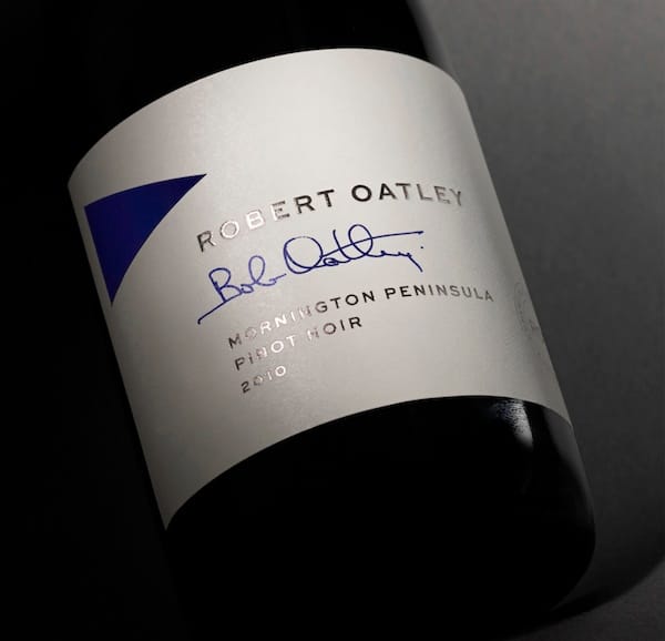
Denomination won a trophy at the London DBA Design Effectiveness Awards last year for the Robert Oatley Signature Series. The redesign of the package led to a 301 percent increase in sales and a 52 percent decrease in label print costs.
For more information please visit www.denomination.design


Recent Comments